Square²
Square released a new version of Card Case this morning (renamed Pay with Square), and the update falls flat. Card Case is no longer distinctive. It’s had its name changed to be the same as the main Square app, has been given a faux-iridescent icon, and has lost all of the personalization that gave the original a bit more attitude than your average iOS app.
I’m very surprised to see Square misstep so badly. Between Square and Simple, I was excited to see where this trend of personal design-y financial services will head. This update seems to signal that Square is backing up and becoming a little more, well, square as they shift more towards payment processing for small businesses.
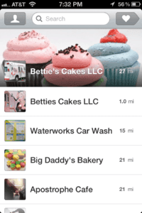
Before, the app had my initials, and a card that was my own. Now it’s just a list of stores with a Square reader nearby. This is a tired UI, and it’s not getting any newer. Square has also seen fit to change the app’s icon. Gone is the small card case along with the leather texture. In its place is a poor imitation of the shiny spot found on a credit card, along with a shrunken-head version of the Square logo. It’s not terribly inspired. Even worse, Square has decided to give these apps the same name, so when both are updated in the same day, it’s awfully hard to discriminate between the two of them.
I hope someone enjoys this update, because I surely don’t. While I’ll continue to pay with Square because it’s easier, Square’s sucked the fun out of it.
