The Instagram Header Gallery
Instagram’s profile page has a gallery at the top which serves as the profile’s header, arranging a subset of a user’s photos in a grid. From load, the grid’s cells crossfade between photos. Each cell transitions between two photos before moving deeper into a user’s collection.
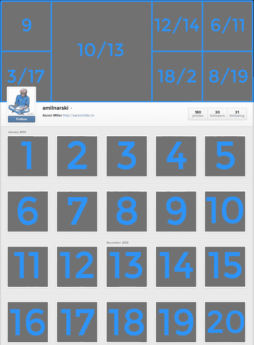
I’ve watched this process a few times and have been interested in which photos are displayed. Tonight I recorded which photos are displayed in my own header gallery. The following image shows the photos that appear at load and the first photo that is transitioned to.
My Instagram page with photos numbered and the header gallery numbered showing which photos are displayed in first/second format.
With my photos, this design surfaces content that one would not see in the app—of the five most recent photos only one is displayed on load and only two are shown at all. With my current Instagram habits, photos from five weeks ago appear in the gallery, with a median age of 2 weeks. Whatever logic governs the selection of a user’s photos is certainly contained within the page’s Javascript, but delving into code is beyond tonight’s observation.
The wide range of photos displayed in the header gallery does a good job of delivering the zeitgeist of a user’s recent photos (my gallery is filled with winter, Willow, and coffee). Instagram’s header gallery provides an entertaining and unpredictable snapshot of a user’s photos. I’d be content to see this concept on other sites.
Update (02/11/13):
I’ve been watching the content that fills my header gallery more closely after writing this post. While writing it I noticed that the photos chosen for gallery were those that generated some acclaim (in the form of likes and comments). Correlation definitely exists and I feel confident that it’s closer to causation.
I would now guess that content is selected for the header gallery using likes, comments, and time to rank images and that the gallery content is not selected from a fixed point in a user’s photo stream.
